Animated Visualizations in Python using Matplotlib
Visualizations are a great way to convey insights from data. Animated visualizations are, in suitable cases, more engaging and better at storytelling than their static counterparts. This article is a walk-through of animating cumulative confirmed COVID-19 cases in each country per day. The final result looks something like this:
This animation shows the total number of COVID-19 cases till date from 22nd Jan 2020 to 10th May 2020, showing the top ten countries with confirmed cases. After this walk-through, we’ll end up with a boilerplate code that can be used to animate other types of visualizations(say, histograms or pie-charts) and different data sets.
Getting Data
For this visualization, I chose this dataset(covid_19_clean_complete.csv) on COVID-19 cases, which is already extracted and cleansed. It is maintained by an individual by scraping various official sources and putting it together in proper form. It should not be considered as accurate as the official sources, but for our animation it’ll suffice.
Importing necessary libraries
We’ll be using the following libraries for formatting the data and plotting.
import pandas as pd
import numpy as np
import matplotlib.pyplot as plt
import matplotlib.animation as animation
%matplotlib widget
%matplotlib is an IPython magic function that lets us set the graphing backend that matplotlib uses. Animation support depends on the backend you’re using, make sure to use a backend that supports animation. Usually, if you’re using Jupyter notebook, use %matplotlib notebook and if on Jupyter lab, use %matplotlib widget.
Structure of data
Reading the .csv file obtained into a pandas dataframe, and printing the first five rows using pd.read_csv gives us:
pd.read_csv('covid_19_clean_complete.csv',parse_dates=['Date']).head()
| Province/State | Country/Region | Lat | Long | Date | Confirmed | Deaths | Recovered | |
|---|---|---|---|---|---|---|---|---|
| 0 | NaN | Afghanistan | 33.0000 | 65.0000 | 2020-01-22 | 0 | 0 | 0 |
| 1 | NaN | Albania | 41.1533 | 20.1683 | 2020-01-22 | 0 | 0 | 0 |
| 2 | NaN | Algeria | 28.0339 | 1.6596 | 2020-01-22 | 0 | 0 | 0 |
| 3 | NaN | Andorra | 42.5063 | 1.5218 | 2020-01-22 | 0 | 0 | 0 |
| 4 | NaN | Angola | -11.2027 | 17.8739 | 2020-01-22 | 0 | 0 | 0 |
Date at the given Province/State.We are interested in top 10 countries by Confirmed cases on each particular date. We can use the pandas groupby and aggregate function to get total confirmed cases per day in each country as:
#read the dataset
covid_df = pd.read_csv('covid_19_clean_complete.csv',parse_dates=['Date'])
# Total by date and country
covid_df = covid_df.groupby(['Date','Country/Region']).agg({'Confirmed':np.sum})
# Get Top 10 Contries based on confirmed cases per date
covid_df = covid_df.groupby('Date')['Confirmed'].nlargest(10).reset_index(level=1,drop=True)
covid_df is now a Series with two indices(date and country). Getting the first 20 entries using covid_df.head(20) gives:
Date        Country/Region
2020-01-22  China             548
            Japan               2
            Thailand            2
            South Korea         1
            Taiwan*             1
            US                  1
            Afghanistan         0
            Albania             0
            Algeria             0
            Andorra             0
2020-01-23  China             643
            Thailand            3
            Japan               2
            Vietnam             2
            Singapore           1
            South Korea         1
            Taiwan*             1
            US                  1
            Afghanistan         0
            Albania             0
Name: Confirmed, dtype: int64
This is the data we need for the visualization. With the data done, let’s move on to plotting.
Visualization
As seen on the introduction video, we’re planning to plot a horizontal bar chart of the top ten countries based on cumulative confirmed COVID-19 cases. First we’ll plot the data for a single day, then extend it as an animation showing the change on each successive day.
Choosing a color for a country
Since we have several countries and the bars will be changing and switching positions as the animation progresses, it makes sense to give each country a particular color to be used while plotting the bar chart. We can use matplotlib’s colormap as follows for that:
#Country is the second level index of_covid_df
countries = np.array([ country[1] for country in covid_df.index])
countries = np.unique(countries)  #Countries can be repeated on different Dates
cmap = plt.get_cmap('tab20')
colors = cmap(np.linspace(0, 1, len(countries)))
color_dict = dict(zip(countries,colors))
There are some predefined colormaps, I chose to go with tab20. A list of which can be found here. After running the above code, color_dict is a python dictionary that has colors corresponding to each country’s name in covid_df. We will use it later when plotting the bar charts.
Plotting a bar chart
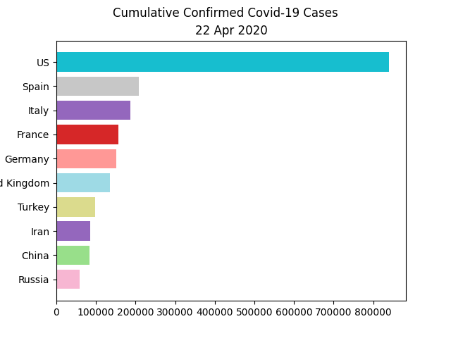
Let’s plot a horizontal bar chart for the date 4/22/20. We’ll be using pyplot’s barh function.
plt.figure()
date = pd.to_datetime('4/22/20',format="%m/%d/%y")
xvals = covid_df.loc[date].index
data = covid_df.loc[date].values
bars = plt.barh(xvals,data,color=[ color_dict[country] for country in xvals])
plt.suptitle('Cumulative Confirmed Covid-19 Cases')
plt.title(date.strftime("%d %b %Y"))
ax = plt.gca()
ax.invert_yaxis()
The first two positional arguments of barh are the x-values(in our case, the top 10 countries) and corresponding y-values(number of confirmed cases). Corresponding colors(from Output of the above code snippetcolor_dict) of each country in x-value is given as array to color argument.
Improving our bar chart
Before moving on to animating the visualization, let’s make a few more improvements. The improvements we’ll make are: removing the borders, removing the tick marks, and making the values on the beside the bar itself rather than on the x-axis below.
# Removing borders
for spine in ax.spines.values():
    spine.set_visible(False)
# Removing Tickmarks and values in X-axis
plt.tick_params(left=False, bottom=False, labelbottom=False)
# Labelling The bars directly
for bar in bars:
    ax.text(bar.get_width(), bar.get_y() + bar.get_height()/2, '  ' + str(bar.get_width()), va='center')
After this, the chart looks like this:

Animating the plot
For animating the plot, we will use matplotlib’s FuncAnimation function. FuncAnimation animates by repeatedly calling an update function. We will write the update function such that it will render the bar chart for successive days based on the index given to it. We’ll be reusing the code for single bar chart of the previous section.
# Each uniuqe date we have in covid_df
dates = np.sort(np.unique(covid_df.index.get_level_values(level=0)))
n = len(dates)

def update(curr):
    if curr == n:
        # Last date we have in covid_df
        a.event_source.stop()
    plt.cla()
    date = dates[curr]
    xvals = covid_df.loc[date].index
    data = covid_df.loc[date].values
    bars = plt.barh(xvals,data,color=[ color_dict[country] for country in xvals])
    plt.suptitle('Cumulative Confirmed Covid-19 Cases')
    plt.title(pd.to_datetime(date).strftime("%d %b %Y"))
    ax = plt.gca()
    ax.invert_yaxis()
    # Removing borders
    for spine in ax.spines.values():
        spine.set_visible(False)
    # Removing Tickmarks and values in X-axis
    plt.tick_params(left=False, bottom=False, labelbottom=False)
    # Labelling The bars directly
    for bar in bars:
        ax.text(bar.get_width(), bar.get_y() + bar.get_height()/2, '  ' + str(bar.get_width()), va='center')
fig = plt.figure(figsize=[11,5]) #Adjusting margins
a = animation.FuncAnimation(fig, update, interval=100, frames=n,repeat=False)
Each date we have from covid_df is stored in the dates array and sorted. FuncAnimation repeatedly calls our update function with loop number as parameter(curr). Therefore on each call, the bar chart corresponding to Date is called and incremented. Interval is the time delay between each calls in ms. That gives our output:
We can use a.save('filename.mp4') for saving the animation as a video, more on that is available here. The update function above can be treated as a boilerplate for animating different types of plots, replace barh with any other suitable plotting functions. View the complete code in this Jupyter Notebook or download it.
It is also possible to create simple interactive visualizations having sliders and buttons using matplotlib, I’ll save that for another post.
